Past Paper
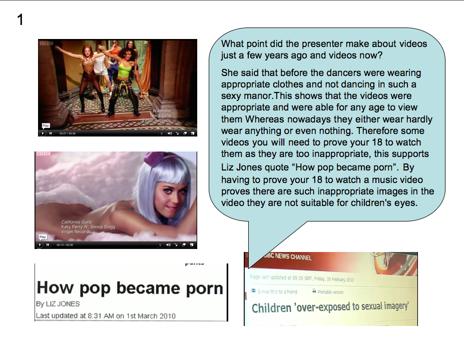
1)Explain two ways the extract fits the genre of lifestyle magazines. Use examples from the extract.
First of all this magazine fits the genre of lifestyle magazines because it uses a conventional mix of content. This mixture of content is all included on the front cover on the magazine in cover lines. Some are linked to fashion "easy elegant summer dressing", "loose, sexy hair" which advise or inform the reader of what could be the new style in the upcoming month or season. There's also content to do with summer "summer's here" is the quit obvious one which could include about fashion for summer or simple ideas for the hot weather "simple recipes and outdoor entertaining ideas". As well this magazine includes content on marriage " the marriage crime you don't even know you're doing", this could be advising wives of the misdoings that they are partaking in.
Another way this fits the genre of lifestyle magazines is because it uses a direct mode of address in various ways. This is used to make the magazine seem more informal and friendly with the reader. First of all on the main image direct address is used as Kylie Minogue has her eyes looking towards you(the reader). Also many personal pronouns such as "you", "your" these all make the reader feel more of a connection with the magazine.
2)Explain how each of the following is used in the extract to create effect:
- Layout
- Typography
- Colour
- Language
- Use examples from the extract.
I think that the cover of this magazine is asymetrical because there is a rough balance of cover lines on each side of the magazines cover. Also there is one darker item that is balanced my several lighter coloured cover lines. The magazine cover has a variety of different typography, serif and sans serif are both used. This variety of sans serif and serif shows that the magazine is sophisticated and elegant but at the same time shows its youth and modernerity. This makes the magazine more informal as it isnt all sophisticsted and elegant, therefore the sans serif font creates a good balance with serif font. The colours used on the front of this magazine are mainly pink and black. Pink is usually associated with female, this shows that straight away the magazine is aimed at females with large, bold, pink writing as the masthead. The colour black has many negative conotations but at the same time it can express confidence, this can show confidence in the opinions of what could be said in the magazine. This cover uses a few imperitives such as "what your friends really think of you" and "skin you'll be raring to bare". These are used to give orders to the audience, it makes the sentence more alert as though it's aimed towards you.
3)
3)